As the clash between physical and digital heats up, clickbait and infographics have now become direct marketing’s new battleground. These two inherently digital content marketing tactics, gracing blogs and agency sites alike, have gained considerable traction over the years due to their effectiveness. Sure, there are no less than 12 unbelievable reasons why clickbait gets the job done…and equally impressive support for the use of infographics, but how do these results translate to direct mail marketing? In this post, we'll dissect how digital tactics are being used in the physical world and how direct marketers can tastefully incorporate these elements into direct mail pieces for increased engagement.
Numbers Don't Lie
Chances are strong that if you're reading blog posts, you've encountered clickbait or an infographic online. In short, these content marketing tactics play primarily on the "curiosity gap" (the discrepancy between what we know currently and what we would like to know), to drive click-thru's and thereby engagement. Although they take slightly different paths and have different strengths i.e. clickbait is effective in email marketing and infographics shine on lengthy/content-rich blog posts, the fact remains: clickbait and infographics work.
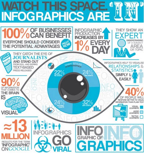
A recent study by CopyHackers confirmed that playing on the curiosity gap increased clicks 927% on their pricing page. Similarly, SearchEngineJournal.com provides an infographic (on infographics) with some pretty compelling statistics:
Direct Mail Goes Digital
With all of this evidence to lend support, it comes as no surprise why designers and copywriters have started incorporating clickbait and infographics into direct mail design. By re-purposing these elements, marketers are betting they can drive increased engagement and stand out in the mailbox. Let's take a look at 4 examples of DM that put these digitally familiar techniques to use. (Disclaimer - these examples were sourced from the web, and do not represent our clients, our work or our endorsement).
Example 1

In the first example (above), we see the outer envelope of a direct mail piece decked with a clickbait-esque headline: "77 OF YOUR TOUGHEST QUESTIONS about God & The Bible ANSWERED!" Assuming the enclosed material is relevant, this "in-your-face" headline plays on the curiosity implicit of human nature: we all have spiritual questions that may arise and realizing the potential to answer no less than 77 of them can be compelling – hopefully, compelling enough to open. The alternating capital/normal case and color against the black backdrop, also enhance the readability of the DM and increase the chances of capturing the prospects attention.
Example 2

This second example of clickbait-style direct mail incorporates a bold visual element on the outer envelope, as well as another clickbait-inspired headline, "10 THINGS you never knew about the ocean that will amaze you! NUMBER 3 will take your breath away..." The picture of the shark is certainly something to catch the reader's attention, and the image works appropriately in conjunction with the colorful, mixed-case headline that bumps up the open-ability of this piece.
According to TargetMarketingMag.com, the enclosed leaflet that showcased the 10 ocean facts was, in fact, compelling and congruent to the mission of protecting ocean life. They also made note that the No. 1 fact – that only one in a 1,000 sea turtles now survives into adulthood because of human activity – was poignant enough to make readers want to cry (and act upon).
Example 3

This example showcases an infographic-style multi-fold direct mail piece. This piece skillfully incorporates an infographic in all of its glory, taking up the real estate of all four panels with large typeface, concise info and colorful iconography. Each bold element of the display serves to draw attention to the piece's main message.
It's also important to note the effective use of space and folding, with each panel used to frame distinct pieces of information. Contributing to the overall understanding of the topic at hand, this sectional organization is its own form of storyfelling, giving a clear run-down of the most important facts in a way that's easy to digest.
Example 4

Our fourth and final example, a postcard sent by the University of Maryland Baltimore County (UMBC), is a prime instance of how infographic use can enhance direct mail effectiveness with limited space. In this case, the university's mascot logos take up a majority of the real estate, leaving a noticeably smaller portion dedicated to the infographic.
To highlight important facts about the university, UMBC utilized a clean typeface, large numbers and minimal copy, highlighting the essentials in a bite-size format. By doing so, the postcard makes for a student-recruitment tool that's more likely to stand out amongst the bulky prospective student packets that too often boast a photo of an undergrad smiling next to a tree.
Key Takeaways
As physical continues to take cues from its digital counterpart, we recognize some of the best direct mail tactics for a clickbait or infographic inspired campaign:
When it comes to clickbait in direct mail, be sure to:
- Backward-engineer your clickbait headline based on your knowledge of the target audience – what pain points would they want answered through your DM?
- Confine clickbait use to the outer envelope – the "opening" action needs to be positioned to fill the curiosity gap: "When I open this envelope, I will learn something useful."
- Avoid being spammy; be sure to use emphatic words sparingly.
- Alternate colors, typeface and sizing to entice; A/B test to further refine.
When it comes to infographic use on direct mail pieces, be sure to:
- Match the infographic with the message and purpose – storytelling and statistical infographics work particularly well in acquisition pieces.
- Create "flow" within the infographic, keeping in mind size limitations. A good infographic has the ability to convey an idea in a seamless and sequential fashion. Be intentional with the placement of certain elements as this "flow" will help engage the reader in a meaningful way and, ultimately, drive a response.
- Allocate a budget for infographic creation; as their use becomes more pronounced, it takes sharper creative designs to truly stand apart.
